Sun Grain
A corporate website for a grain and flour brand
Кейс Sun Grain: корпоративный сайт для производителя зерна и муки с продуктовой витриной, блоками качества, упаковкой и быстрым контактом.
Explore the case
- 4
- key website blocks
- 2
- flour product lines shown
- 1
- fast path to inquiry
Product thinking
Product origin is part of the brand
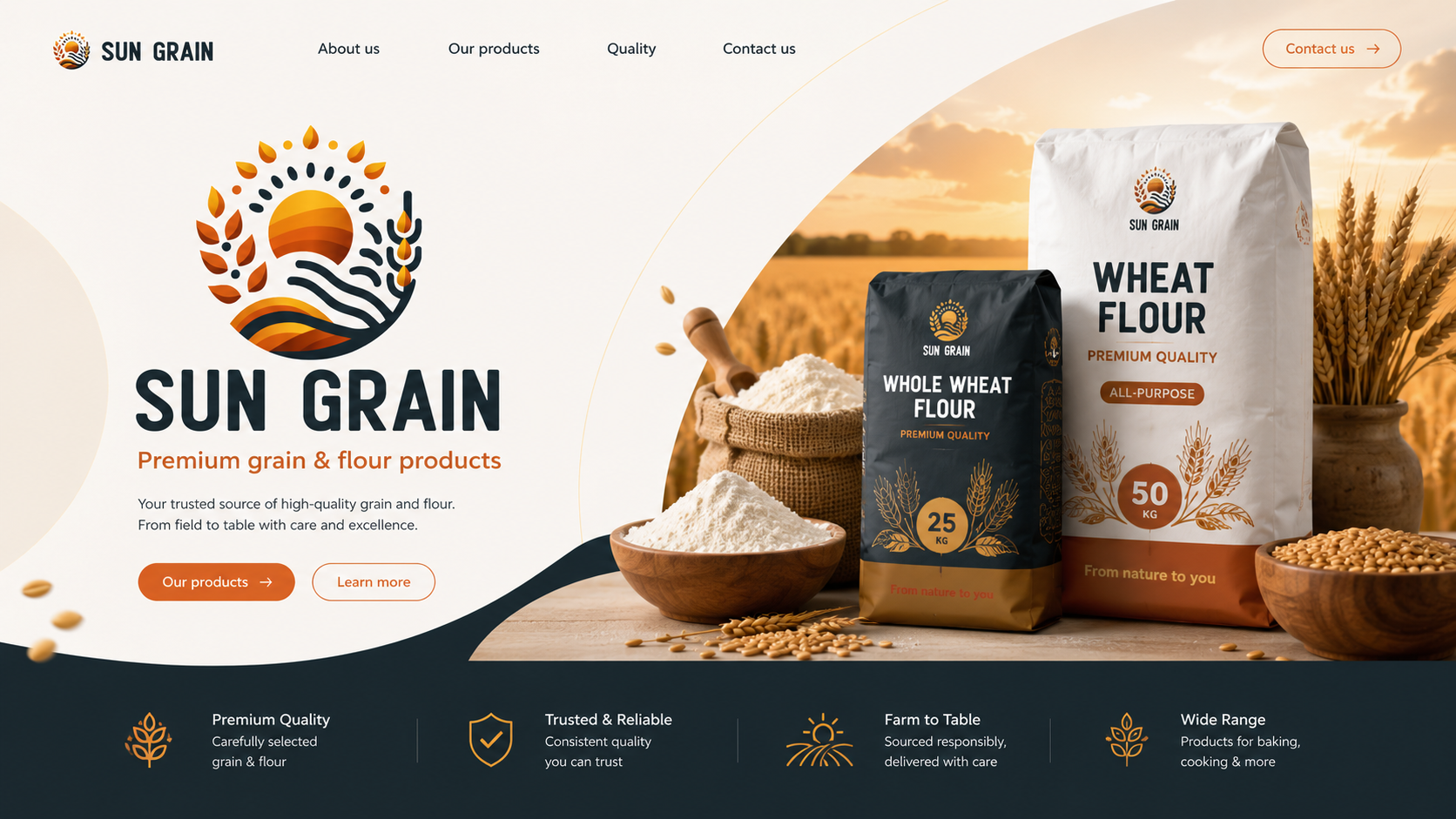
A grain and flour presentation connects packaging with product quality and origin. Field imagery, the range and benefits describe what the brand offers and why buyers may consider it as a supplier.
A warm visual language is supported by clear company, product, quality and contact sections. Wholesale visitors can start with the range or the brand story before discussing supply.
Brand and origin
Product range
Quality
Wholesale enquiry
Sun Grain presents its grain and flour product line through a warm visual language, clear quality benefits and a fast path to contact for wholesale customers.
Context
For a grain and flour producer, the website has to build trust quickly: show product origin, quality, packaging and readiness to handle B2B inquiries.
Task
Build a modern brand showcase: a product-led hero, company section, product line, quality benefits and a clear contact flow.
Focus
We focused on natural warmth, premium quality and reliable supply: from field and grain selection to packaging and sales contact.
Visual layer
A product showcase that explains brand value at first glance
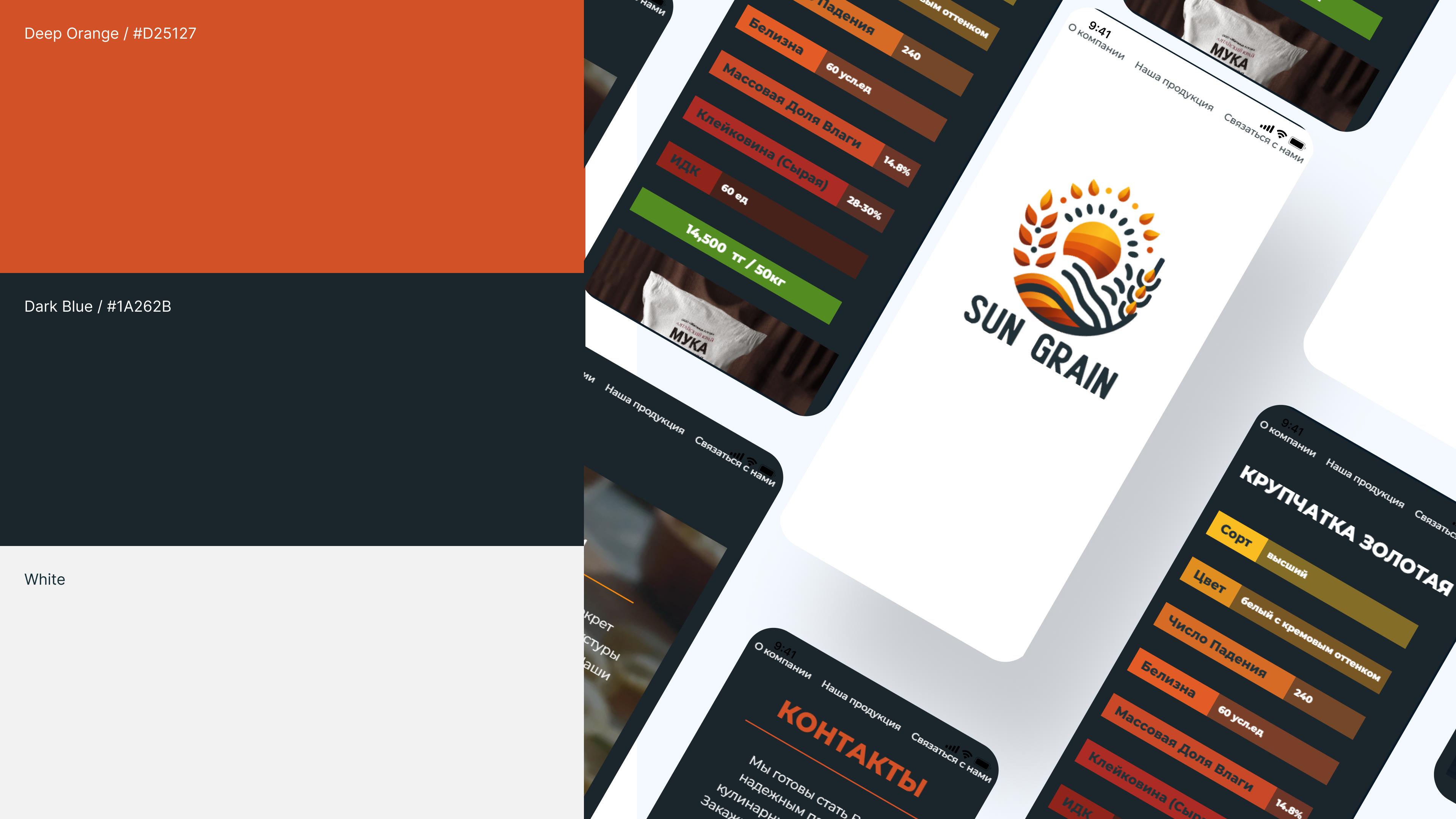
The hero combines the brand mark, packaging, wheat field and key benefits. Visitors quickly understand that Sun Grain sells grain and flour, see the product quality and can move to the product line or contact section.
What we did
From meaning to system
Structured the website
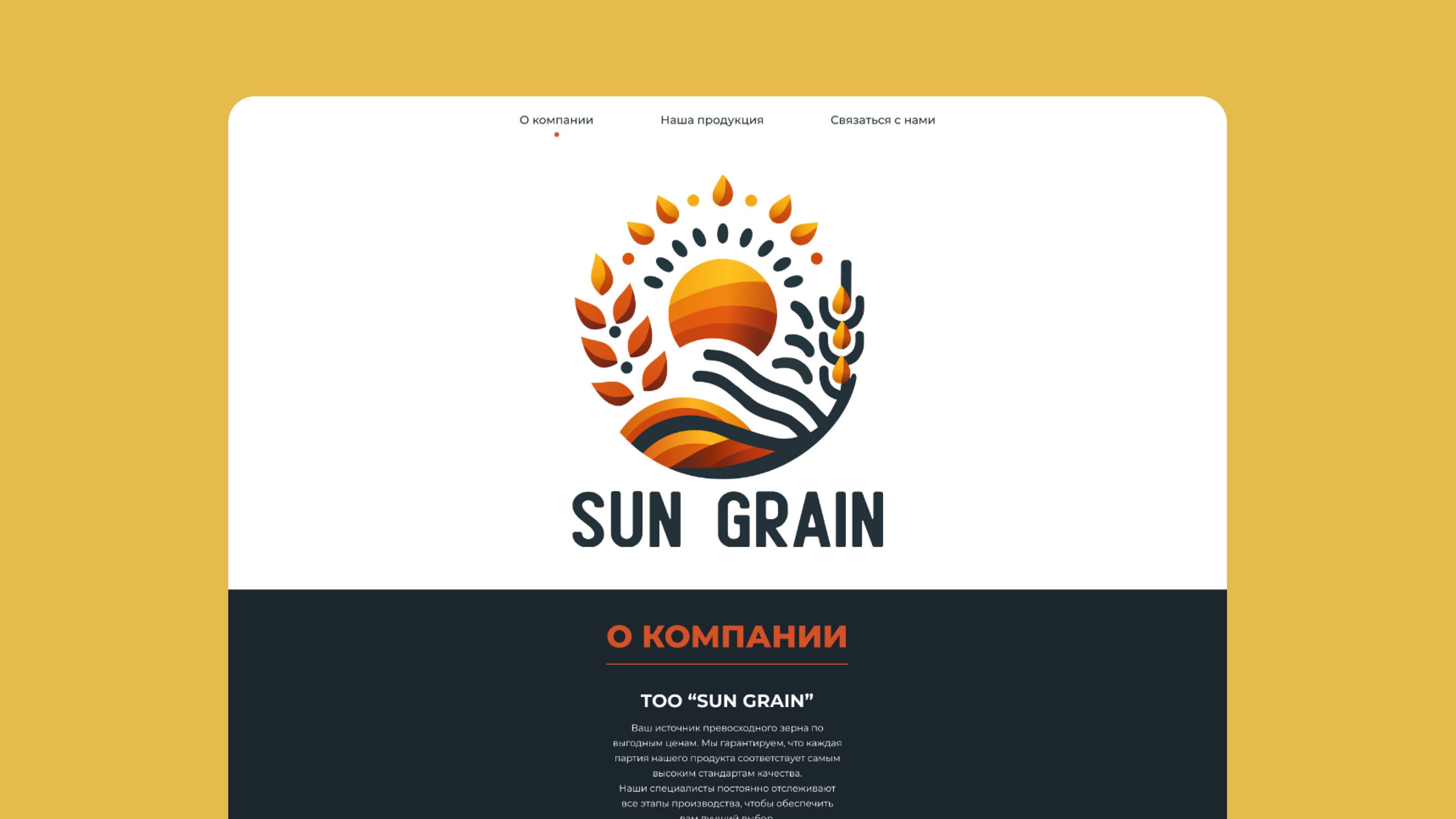
We split the page into clear blocks: brand, about the company, products, quality, benefits and contact. The site works both as a presentation and as an inquiry entry point.
Packaged the product line
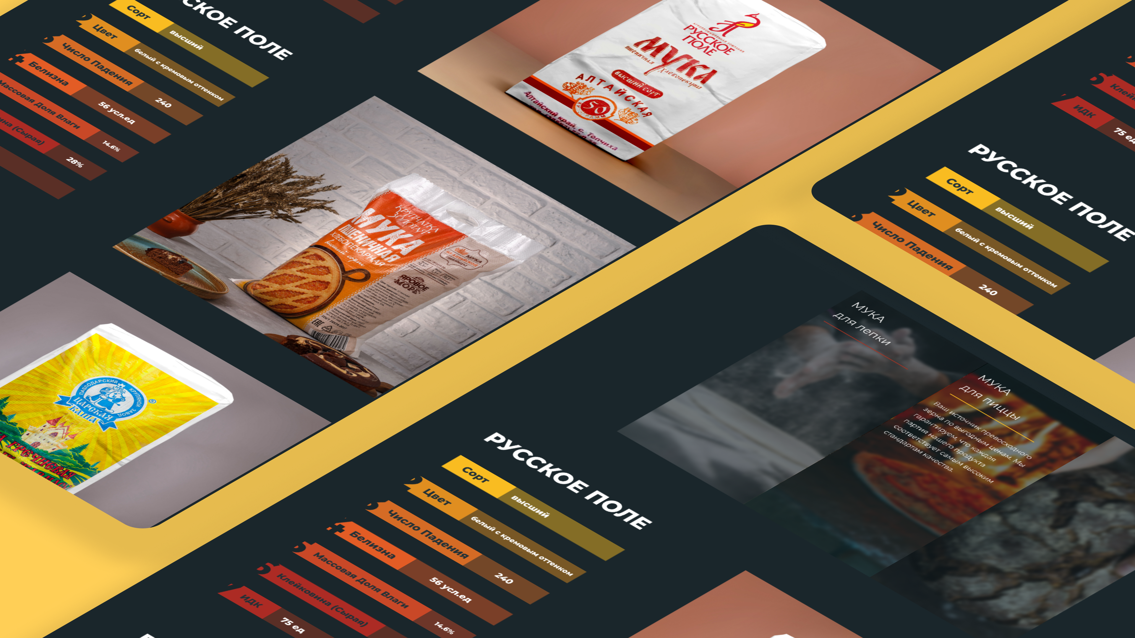
We presented flour, whole wheat flour and grain products through packaging, weight, use cases and visual accents that make the assortment easy to read.
Built a trust-focused tone
We added warm agricultural aesthetics, clear quality benefits, a farm-to-table message and calm navigation so the brand feels like a reliable supplier.
Result
A clean showcase website for an agro brand
Sun Grain received a clear digital presentation: the product is visible from the first screen, benefits are easy to scan, and the path from interest to contact stays simple.
- 4
- key website blocks
- 2
- flour product lines shown
- 1
- fast path to inquiry
Related services
Build a product on the experience behind this case
Explore the relevant development directions, scope, timelines and launch approach.
Corporate website developmentB2B systems and web servicesNext step